Sunday, April 6, 2008

Assignment 4

The assignment for this week is poster creation. We each have to create a poster under the theme "Save, Prevent or Kill".


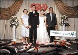
My theme was "Save Sharks". The initial idea I have got was from a postcard (below) which depicts dead sharks at a scene of a Chinese wedding. The visuals brought out the message clearly and in fact, dramatically. The dead sharks had such a striking contrast with the happy couple and their parents that it immediately sends a shiver up my spine thinking about the number of sharks scarified just to fulfill our novelty. The card was one of the best campaign materials I have ever seen.


Draft 1

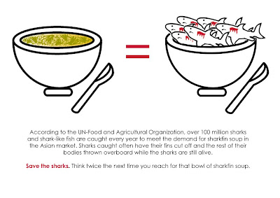
With inspiration from the postcard, I proceeded to draft out my idea. The initial idea was "a bowl of sharksfin = a bowl of many dead sharks", to depict the idea that by consuming a bowl of sharksfin, you are killing the sharks. However, the final product (see below) wasn't so successful because of the technicalities required. I was unable to get the colour tone for the porcelain bowl because photoshop didnt have that colour. I was also stuck at using gradient and brushes to make the bowl looked 3D. The sharks looked a bit cartoonised and the whole poster just looks... bland.

Comments received in class:

- Not dramatic enough

- Good idea but requires more proficiency in software to convey the idea

- Change the orientation of the poster as vertical A4 is more appealing to the eye.

Draft 2

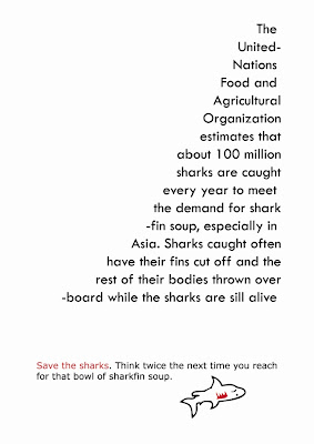
So with that, I had decided to scrap my original idea and worked on others. Came up with another 2 drafts. For the first draft, I had tried to play around with the text. Re-arrange them into the shape of a fin, with the final statement at the bottom (save sharks was highlighted in red because that is the focus of the poster) and a "dead shark" at the bottom to relate back to the topic. However, only Alfred could see the "fin". Comments received generally were not too positive as many people saw the fin as a "triangle".

Draft 3

The last idea was better received as many commented that the sense of realism is there. The drippping blood also provided continuity from the hand to the text. I had took a photograph of the fin from an encycopedia and trace it out using Illustrator before colouring it. I also took a photograph of my own hand holding a knife before adding in the blood. Smudge and Burn Tools from Photoshop were used.
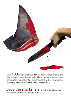
Wednesday, April 2, 2008

Assignment 6: Good/Bad examples of Posters

Good

Evaluating the poster via the Principles of Interaction,

Unity
Contrast
Harmony

There is unity in colour. As can be seen in the poster, the colours used are mainly dark colours in shades of green and black. There is also sufficient colour and size contrast between the background, the figure and the words, thereby giving the eye a clear indication of where to focus on first. For instance, the eye will be first drawn to the figure of the girl as it takes on the largest portion of the poster (contrast of size).


In terms of harmony, equilibrium through a symmetrical balance is noted between the figure and the text (see Figure 1).
Figure 1

Evaluating the poster in terms of Gestalt Principles


Figure and Ground
Proximity
Similarity
Continuity
Closure

As mentioned earlier, the figure of the girl at the top of the poster is the figure as it is noted to have more details and is smaller in size. Sufficient colour contrast between the figure and ground also differentiates them well.

Proximity is concerned with where items are placed. In this poster, good proximity is observed. There are horizontal spacing between the words but no vertical spacing. Therefore, the eye will read Brian Van Holt and Paris Hilton instead of Brian Paris and Van Holt Hilton (see Figure 2).
In terms of similarity, the similar fonts and font size and colours of the words would lead the eye to view them as a group (see Figure 2 and 3).

Figure 2

Figure 3

In terms of continuity, good continuity is used in controlling the movement of the eye. Colour and size contrast draws attention to the Figure first. The dripping wax from the Figure serves as a direction indicator for the eye to shift downwards to read the three words "prey, slay and display". Good continuity is also observed in the position of the words as they lead the eye downwards to the movie title "House of Wax".


Bad

I was in-charged of doing the good poster so I didnt really search for bad posters. But I had noticed that majority of my classmates seem to have taken movie / advertisements posters of the 60s as examples of bad posters. Yes, I do agree that under the Gestalt Principles, those posters are probably defined as "bad" posters as they are cluttered, use too many colours, subjects are too close in proximity, no proper figure and ground, but then again, the definition of "bad" and "good" poster stretches beyond the Gestalt Principles and other design technicalities.

The context of the poster (such as culture) is one important factor to consider. I personally feel that the oldies posters had their appeal back then probably because there was more leisure time for people to go up close and read the information on the poster. Or the posters could have cluttered all the information in a poster because people had desired those information.

In contrast, the posters of modern days are often simplified to convey only a particular meaning. They often contain only 1 figure, a few words and few colours. This is probably to match the busy schedule of the urban people, who have but time to read the posters in detail.

Just my two sense worth.

Class today was very enlightening.