Sunday, April 6, 2008

Assignment 4

The assignment for this week is poster creation. We each have to create a poster under the theme "Save, Prevent or Kill".


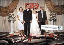
My theme was "Save Sharks". The initial idea I have got was from a postcard (below) which depicts dead sharks at a scene of a Chinese wedding. The visuals brought out the message clearly and in fact, dramatically. The dead sharks had such a striking contrast with the happy couple and their parents that it immediately sends a shiver up my spine thinking about the number of sharks scarified just to fulfill our novelty. The card was one of the best campaign materials I have ever seen.

Draft 1

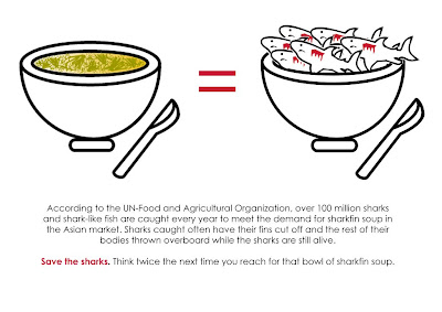
With inspiration from the postcard, I proceeded to draft out my idea. The initial idea was "a bowl of sharksfin = a bowl of many dead sharks", to depict the idea that by consuming a bowl of sharksfin, you are killing the sharks. However, the final product (see below) wasn't so successful because of the technicalities required. I was unable to get the colour tone for the porcelain bowl because photoshop didnt have that colour. I was also stuck at using gradient and brushes to make the bowl looked 3D. The sharks looked a bit cartoonised and the whole poster just looks... bland.
Comments received in class:

- Not dramatic enough

- Good idea but requires more proficiency in software to convey the idea

- Change the orientation of the poster as vertical A4 is more appealing to the eye.

Draft 2

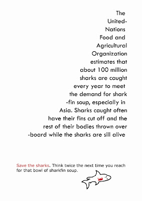
So with that, I had decided to scrap my original idea and worked on others. Came up with another 2 drafts. For the first draft, I had tried to play around with the text. Re-arrange them into the shape of a fin, with the final statement at the bottom (save sharks was highlighted in red because that is the focus of the poster) and a "dead shark" at the bottom to relate back to the topic. However, only Alfred could see the "fin". Comments received generally were not too positive as many people saw the fin as a "triangle".
Draft 3

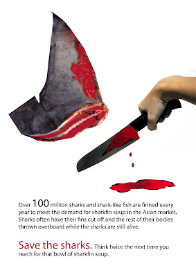
The last idea was better received as many commented that the sense of realism is there. The drippping blood also provided continuity from the hand to the text. I had took a photograph of the fin from an encycopedia and trace it out using Illustrator before colouring it. I also took a photograph of my own hand holding a knife before adding in the blood. Smudge and Burn Tools from Photoshop were used.

Wednesday, April 2, 2008

Assignment 6: Good/Bad examples of Posters

Good

Evaluating the poster via the Principles of Interaction,

Unity
Contrast
Harmony

There is unity in colour. As can be seen in the poster, the colours used are mainly dark colours in shades of green and black. There is also sufficient colour and size contrast between the background, the figure and the words, thereby giving the eye a clear indication of where to focus on first. For instance, the eye will be first drawn to the figure of the girl as it takes on the largest portion of the poster (contrast of size).


In terms of harmony, equilibrium through a symmetrical balance is noted between the figure and the text (see Figure 1).
Figure 1

Evaluating the poster in terms of Gestalt Principles


Figure and Ground
Proximity
Similarity
Continuity
Closure

As mentioned earlier, the figure of the girl at the top of the poster is the figure as it is noted to have more details and is smaller in size. Sufficient colour contrast between the figure and ground also differentiates them well.

Proximity is concerned with where items are placed. In this poster, good proximity is observed. There are horizontal spacing between the words but no vertical spacing. Therefore, the eye will read Brian Van Holt and Paris Hilton instead of Brian Paris and Van Holt Hilton (see Figure 2).
In terms of similarity, the similar fonts and font size and colours of the words would lead the eye to view them as a group (see Figure 2 and 3).

Figure 2

Figure 3

In terms of continuity, good continuity is used in controlling the movement of the eye. Colour and size contrast draws attention to the Figure first. The dripping wax from the Figure serves as a direction indicator for the eye to shift downwards to read the three words "prey, slay and display". Good continuity is also observed in the position of the words as they lead the eye downwards to the movie title "House of Wax".


Bad

I was in-charged of doing the good poster so I didnt really search for bad posters. But I had noticed that majority of my classmates seem to have taken movie / advertisements posters of the 60s as examples of bad posters. Yes, I do agree that under the Gestalt Principles, those posters are probably defined as "bad" posters as they are cluttered, use too many colours, subjects are too close in proximity, no proper figure and ground, but then again, the definition of "bad" and "good" poster stretches beyond the Gestalt Principles and other design technicalities.

The context of the poster (such as culture) is one important factor to consider. I personally feel that the oldies posters had their appeal back then probably because there was more leisure time for people to go up close and read the information on the poster. Or the posters could have cluttered all the information in a poster because people had desired those information.

In contrast, the posters of modern days are often simplified to convey only a particular meaning. They often contain only 1 figure, a few words and few colours. This is probably to match the busy schedule of the urban people, who have but time to read the posters in detail.

Just my two sense worth.

Class today was very enlightening.

Wednesday, March 19, 2008

Assignment 5

Assignment 5 was to design a greeting card. The objective of the assignment was to show the colour theory; contrast, colour complements, colour psychology etc.

The theme of the card is "love" and we each need to insert a love quote in the card. Did some search on the net for some fresh ideas and but didn't managed to chance upon any nice ones. I then decided to drop by the bookstores to take a look at the greeting cards. Did a search for the love quotes online too but figured out that those are too mushy to be used. Decided to come up with my own quote then.

So after doing the research. I came up with a few guidelines for my card.

1. Layout: It is going to be simple. There are some cards that had the very complicated brush effects and I thought it was too overwhelming. Others had too much hearts or too much pink and red on the cards.

2. Colours used: To portray the meaning of "love", I decided to use pink and purple as the main colours for the card. Guess they would go well since they are complementary colours, according to the colour wheel. The pink and purple shall not be too overwhelming. Down at my trip to the bookstore, I saw cards that just had a whole chunk of pink and red splashing all over the card. That was just simply TOO over.

So with that, I did a few drafts~


The second design; trying out a different colour scheme.


The last cover received the most positive feedback. Moft the work was done in Illustrator with lines and shapes (as usual). Photoshop was used for further editing in adjusting the opacity of the other two colours to create the blending effect, to position the 2 figures and to input the text.


Did the inside and back too~


Comments received:

- Cute and has the appeal

- Good use of colours
- A bit conventional though
- Words are too faint to be seen (I have already darken the colour of the words, hope they look fine)

Sunday, March 9, 2008

Assignment 3

Assignment 3 was to create a visual story with a twisted ending via 10 photos, and easy as it sounds, it is a DAMN HARD assignment.

You could have alot of interesting ideas but time and space (10 pictures) constraint can easily dump away half of your ideas. The other half is dumped due to character constraints (not being able to find people to help out with your story).

The other difficulties I had met with was constructing the flow of the story. Because the story was to be shot in still images, the flow you get from motion is not there. So this results in you having to construct and organise your individdual frames very carefully.

But despite the difficulties, I had real fun overall!

Check out my story below:


Comments received:

- Nice twist

- The switch of photo orientation is weird. I should keep to the 6" X 4" frame.

- The guys looked more like bubbies than "lovers". Some even recommended that I make the look more gay, for instance, getting one of the guys to hold a sling bag. But I didnt want to overdo stuffs, as much as it might add to the visual effects. I don't think it is very nice to stereotype the homosexuals.

So I guess I would just be going to change the guy's red top to pink :)

More comments welcomed!

Thursday, February 21, 2008

Assignment 2

Assignment 2 was to create an abstration process of an image via either iconic representation or indexical representation.

So here's my final abstraction. I hope it shouldnt be too much of a problem because this particular company has done their marketing really well.


Its an Ipod!!! Did you guess it correctly?

My 6 levels of abstraction (after some minor editing)


I spent quite a bit of time doing the abstraction, espeically the 2nd and 3rd images, having to switch from Illustrator to Photoshop and back, at times. But I guess what really got me interested was the abstraction process; how you had to plan the removal of details in a "smooth" manner yet maintaining the impression that it is an ipod.


Comments received from others were generally positive. Some recommended that I remove the time bar on the fourth image (which I did as you can see).

P.S. I like the last abstraction the best. Simple, yet powerful meaning.

Thursday, February 14, 2008

Assignment 1 (after digitalised)

The finalised digitalised copies!! Presentation in class was interesting because you get to review everyone's (well almost) work and everyone gets to review your work.

Introducing "hate"


I changed the "white holes" into bullet holes because one of my friends reflected that the white holes look out of place. Bullet holes would better reflect my "hatred" towards these juicy stuffs, I hope.

Most of the work was done using Adobe Illustrator. Traced the letters using manual trace, which was alot of work. "L" and the curves on "e" were doneusing the lines and shapes in Illustrator. Live Paint was then applied and gradient came in last.


Comments:
- To draw worms crawling out of the holes
- To draw juice spurging out of the holes

I had decided to leave the holes as bullet holes because drawing worms would confuse the "hatred". A few friends commented that people might mistook it "I hate worms crawling out of tomatoes" instead of I hate tomatoes.

And this is love..

Similarly, much of the work for this piece was done in Adobe Illustrator using the lines and shapes.

Comments:

- Name can be seen clearly

- Sweet and neat piece

Tuesday, February 5, 2008

Assignment 1

Had some fun brainstorming ideas for Assignment 1 but the "designer complacency" (a syndrome where one gets obsessed with one's designs and refuse to heed the words of others) came in and I had quite a hard time trying to scrap my initial ideas to work on new ones.

HATE
First Drafts


First drafts for "hate" was totally out of point. Only realised that it was out of draft during tutorial classes. The words are supposed to be part of the picture and not separated.
So I went back and did a few new ideas,


The last idea received the most positive comments. Most people could see my name and the hatred towards tomatoes.

Coloured the last idea and presented it in class. Comments are as below
Comments:
- Tomatoes look like strawberries?!
- Can see the "hatred" towards tomatoes as portrayed by the hammer hitting the tomatoes
- Letter "N" can be further improved on
- Name (Leen) can be seen clearly

LOVE
Love was a easier task. Luckily my drafts did not go out of point.

Comments:
- Can add more creativity to the small "e"s
- Name can be seen clearly except for the letter "E". Looks like "B"
Other comments are welcomed!!